Dec 1, 2015 Urban design
The city’s newest cycle/walkway is an exhilarating urban experience.
This article was first published in the November 2015 issue of Metro. Photos: Monk Mackenzie architects.
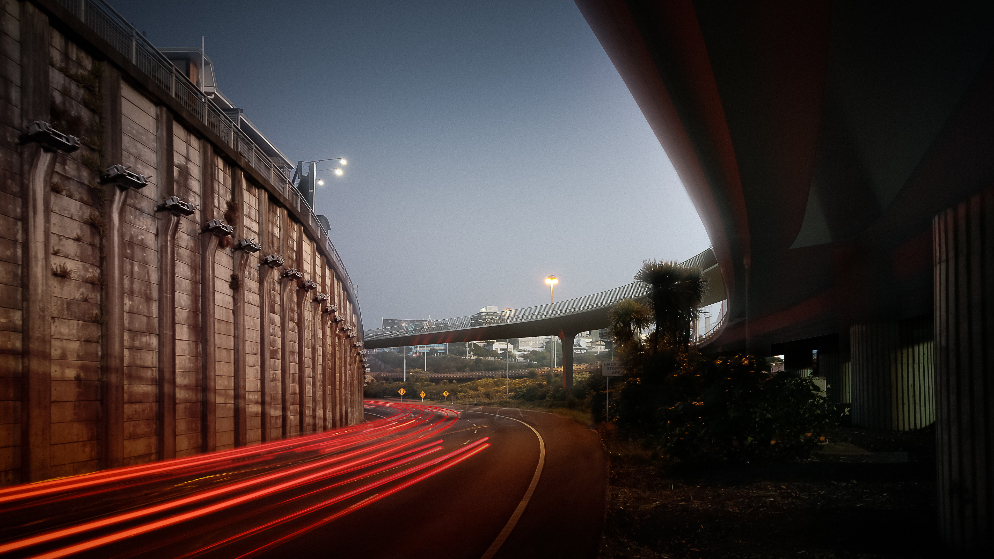
Take the monocoque bridge and then follow the hot pink road. You know Auckland has become a more grown-up city when you find yourself writing a sentence like that. Actually, you could say: Swoop over the monocoque and blast along the hot pink road. Because this is infrastructure that can be taken at speed, even if you’re not in a vehicle.
No, we’re not in Kansas, or Auckland as we know it. And this is not a David Seymour gaffe about what the French love. We’re on the Canada St bridge (a skilfully engineered monocoque structure, which means it supports its loads by an external skin) and the adjoining, redundant Nelson St off-ramp. Auckland traffic whizzes by above, below, on both sides, providing one of the most exhilarating, scary, jangly, unique and brilliantly urban experiences you’re ever likely to have anywhere. My heart races, and I’ve walked it still under construction, with the off-ramp yet to be the hot pink it will become — yes, really.
This is architecture meets engineering meets motorway traffic: a heroic monument to cycle power.
This is architecture meets engineering meets motorway traffic: a heroic monument to cycle power. The bridge — black, sleek and gorgeously curved (so cyclists can go fast) — is a collaboration between Novare Design engineer Duncan Peters and Monk Mackenzie architect Dean Mackenzie. The outrageously flamboyant, slightly camp ramp transformation is down to Monk Mackenzie and Landlab’s Henry Crothers with overall contract management by engineering firm GHD.
The ramp has not been without controversy. Cyclists excited about the project’s promise to help create a magnificent, dedicated city loop — joining Grafton Gully to Nelson St (under construction) and the waterfront — were dismayed to find it had 3m-high throw screens either side. Though the screens were to be transparent, there was disappointment the stunning harbour and city views would be obscured. Blogger Russell Brown dubbed it “sky trench” — “The news is that they’ve fucked it up.”
I didn’t find it that bad. The view is blurred by the screens, but it doesn’t disappear. Strangely, the 7m width of the ramp and outwardly splayed screens add to the drama of the traffic racing by and enhance the sweep of the 700m path.
Mackenzie and Crothers came into the story post throw-screens at the behest of Auckland Council, which wants the project to be the flagship of the city’s expanding cycleway network. They refer to the feedback received when the council went public to ask: “What do you want the road surface to look like?”
First was “modern urban”, followed by “distinctive NZ”, then “subtle and simple” and “bright and bold”. The design ticks all of the above by making a feature of the throw-screens, turning the somewhat brutal supporting posts into light pillars on the city side. The result is an asymmetric light sculpture — a sinuous spine of 300 luminous sentinels for the path from dusk, each with two individually controlled LED strips. It has the potential not just to light the way, but for digital artists to programme them into a magnificent light show.
“We thought, colour is cool,” says Mackenzie. “But what if there was the ability to change and modify the environment as well?” Using road-surface colour to unify the scheme was more or less a given of the brief. It couldn’t be green or blue because it would look like a bus lane. They went for vibrant pink, a nod perhaps to the colourful context of K’ Rd, but also to be whimsical and to differentiate the space from the asphalt and concrete surrounds.
It certainly does that. The non-slip pink aggregate sample they show is arresting and just a little bit sparkly. When the public was asked how the space should be used, first was “cycling”, followed closely by “recreation”, then “enjoyment of environment and views”. The ramp is not just a cycleway. Its area — 4000sqm — makes it an urban park to be enjoyed by promenading or sitting on a series of folded steel bench seats (also pink) at strategic points to enjoy particular views.
In contrast, the deck of the bridge — a ridiculously thin structural skin of tapering triangles — is white aggregate and the handrails “cyclist height” at 1.4m. Somehow the design team was able to convince NZ Transport Agency that here, best practice didn’t have to mean throw screens (to stop people dropping, god forbid, a fridge over the side)..
The bridge, which is a finalist in this year’s World Architecture Festival awards, is supported by a single diamond-shaped column midway between Canada St and the ramp. Magically, the diamond geometry fuses with the triangular deck — some liken it to an unfolding lotus. They call it going co-planar. You might not notice, but this sort of attention to detail is everywhere in this project, and is undoubtedly its secret to success.
The Nelson St cycleway opens on December 3. Bike Auckland are holding an unofficial opening at 7.30pm; cyclists are invited to meet in front of Mercury Plaza for a “first hoon down the Nelson St magenta ribbon thingy”. Sounds fun.
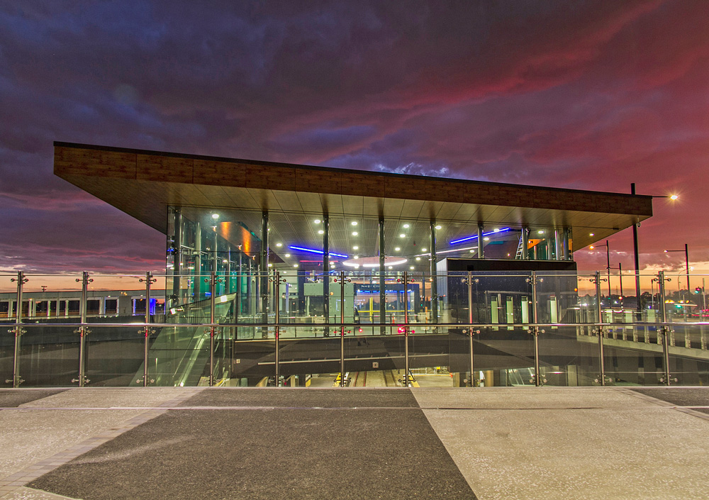
Across town, more magic has sprouted beside Maungarei (Mt Well-ington), further proof that Auckland’s public transport renaissance is breathing new life into the city. The Panmure interchange combines bus, train and road transport. The architecture is a startling glass box and hovering roof plane, reminiscent of Ludwig Mies van der Rohe’s Barcelona Pavilion, soaring against drab suburban surrounds.
Lead architect Victor Rojas of Opus Architecture says there were two key aims expressed in the slightly rhomboid and kicked-up roof form – a gesture of opening to the mountain and a sense of urban presence.“We wanted it to be a beacon landmark for the area.”
Inside is a central circular skylight, from which emanate lines of colour designating landmarks and Maori legends relevant to the area. I’m not a fan of cultural references appended to buildings this way and, in this case, it seems particularly forced. Yet at night, when the lines light up, the effect is terrific.
The brilliance of this building is its verve — something I suspect may be due to Rojas’ Chilean roots. “I quite like clean lines to make a bold statement,” he says. “As you can see, I like contrast.”
Indeed he does. The interplay of black basalt, timber soffit, coloured glass, patterned paving, plus the softening green wall in the train-station trench, well and truly puts Panmure on the map.