Jun 20, 2016 Urban design
There’s more to Ponsonby’s newest retail and office precinct than holes in the walls.
This article was first published in the June 2016 issue of Metro. Photos by Patrick Reynolds.
What a difference a damask makes.
The perforated pattern on the façade of the white Mackelvie St shops off Ponsonby Rd is arresting, disrupting with its frosted modern elegance the muted tones of the Victorian/Edwardian shop frontages.
The white retail precinct, highly commended in the shopping category at the 2013 World Architecture Festival Awards and winner of an NZIA national architecture award in 2015, is about to get some contrast in the form of a black office building taking shape next door. Due to be finished at the beginning of July, it’s set back from the Mackelvie St frontage and runs all the way through to Pollen St, providing a covered pedestrian way along one side. The new building is zoomorphic, perhaps reptilian — a three-level long oblong that kicks up at one end and kinks sideways at the other, its roof, sides and underbelly sheathed in sleek black aluminium sheet adorned with the same perforated pattern of its white sisters. Like its sisters, it’s going to turn heads.
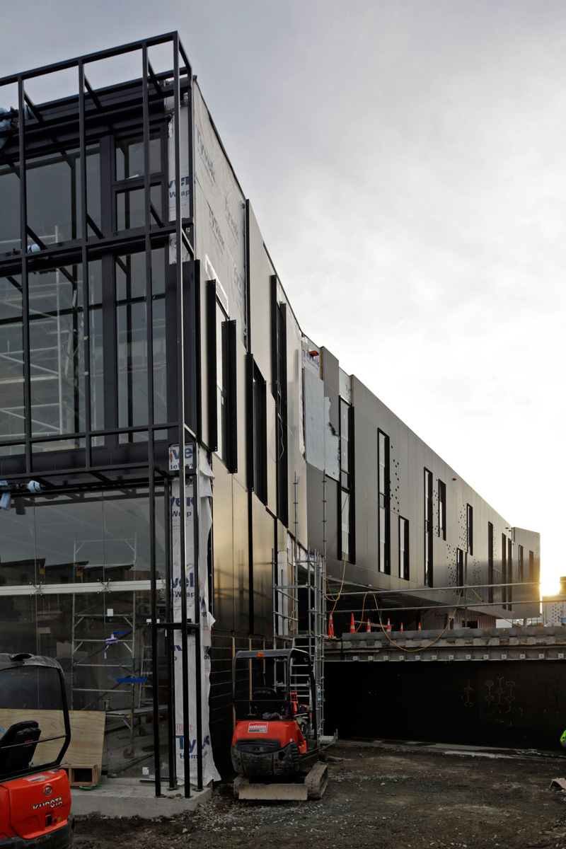
While the form is fascinating, it’s the pattern I’m intrigued by. Decoration in today’s architecture is still relatively rare — a legacy from the austere aesthetic of modernism that we’ve yet to shake off. “We were interested in linking the historical context with these modern buildings,” says Richard Naish, lead architect and founder of RTA Studio. “So we wanted a decorative overlay because without the decoration it would have been just a bit too blunt.”
The pattern he chose was a floral damask of the type that was popular in Edwardian and Victorian times, especially on wallpapers. In fact, they’re everywhere — on tablecloths, carpet, curtains.
Its origin goes back to Byzantine and Islamic weaving in the Middle Ages. The word “damask” is said have come from the pattern’s city of origin, Damascus, though Chinese emperors were wearing damask fabric as early as the fifth century. Historians agree the motif, originally hand woven in silk or satin, was a symbol of luxury that became available to the masses when the Jacquard loom was invented in the 1800s.
There’s a touch of high Ponsonby opulence in the Mackelvie St buildings’ repeated perforation.
There’s a touch of high Ponsonby opulence in the Mackelvie St buildings’ repeated perforation, a tracing of an outline of a damask pattern that’s then abstracted again — a tracing that leaves a trace. The reductive result was a bulbous shape — hence its nickname, “The Onion”, during the design process. “We respect the heritage with the work that we do, but we are looking to develop a language that is speaking towards the future as well as to the past,” says Naish. “So rather than be all backward looking, we borrow from the proportion and scale and sometimes the decoration of the past, and look to produce something that’s progressive and forward looking.”
Naish employed a similar trick for the lace-like screen frontage and canopy of the front courtyard of the Longroom on Ponsonby Rd. There he used the space between the ornate curved balusters of the parapet next door as his contextual trace.
But while RTA Studio is blazing a new contextual trail in a heritage zone, the most significant aspect of this development is the leftover space. Here I find the words of Professor Richard Toy in my first year at architecture school in the early 70s ringing in my ears. Toy said: “Architecture is not so much about buildings but everything about the space between them.”
The new space of in-between and intrigue is at the back of the block of Ponsonby Rd shops that includes the Longroom and Orphans Kitchen . It’s bordered by the snaking new black building, the white Mackelvie St shops on one side and a yet-to-be-built four-storey brick building on Pollen St with rooftop bars looking towards the city and out to the Waitakeres. Laneway access from all three streets. It’s all very Melbourne and gives new meaning to the term “infill”. The planned brick building on Pollen St rises from a small footprint, stacked like jutting Jenga blocks with some of the façades using brick lattice screens. At present, the most disappointing aspect of the new courtyard is that it largely accommodates carparks for the block’s tenancies, including the new offices in the black building.
But the block’s owners, Michael Friedlander’s Samson Corporation, plan for the long-term, at least 50 years out. So while parking in Ponsonby Rd is currently a nightmare, hence the need for carparks, Samson general manager Marco Creemers sees a time when it won’t be as much of an issue and envisages the spaces under the black building one day being used for pop-up retail.
The company sees itself as a property investor, not a developer. “Developers I don’t think have the long-term goals of the city at heart,” says Creemers. “They just want to get in and out and make a profit. You utilise good architects. It’s about good design and places people want to be in and keep coming back.”
These buildings make the case. It’s an urban design formula that now extends laneways from Pollen St to Brown St, and soon possibly Douglas St, with successive enclaves — the new block currently called The Precinct, Lot 3, Ponsonby Central and plans for a development around the Early Settler store in the block between Brown and Douglas Sts. Successive developments that are steadily transforming Ponsonby Rd from a one-track highway into a layered urban trail of hidden interest and intrigue beyond the road, a place where people want to linger. This is how sophisticated urban design should be.