Sep 2, 2022 Property
If you asked me what I wanted to be when I was five, I would have lied and said I wanted to be a lawyer because my parents were listening. But after they left, I’d tell you in hushed tones and big eyes that I wanted to be an artist.
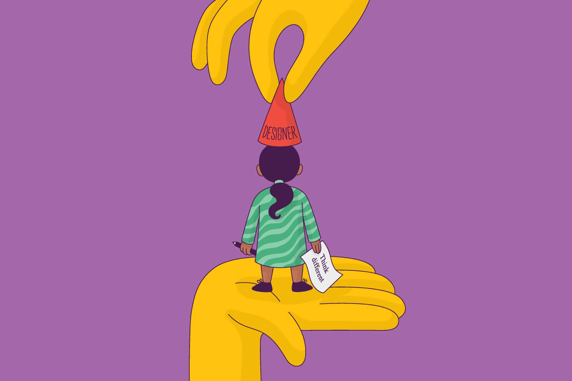
In 2009, I was 23 and working at a serviced office, a space that offers equipment and admin support. I just had to reach a target of billable hours which was always out of reach. I was on thin ice.
My boss was a size-8 Bratz doll. She stared at me like I was the bane of her existence. “Angella, we’ve got a new client, so don’t make this awkward,” she told me. “And put some lipstick on. You look washed out.”
Disclaimer: I’m not good at admin. On my CV, I said I was a fast typist with a passion for administration. That’s a lie. I hate administration. In my heart, I was an artist but by now, the closest I’d been to art was choosing the border for a memo. I dreaded taping it on to the photocopier. The text scowled at me in Times New Roman.
“Friendly reminder to refill Tray 3 and Tray 4! 🙂 ”
I waited for everyone to go to lunch before I taped it to the photocopier. When I turned around, the new client was behind me. Marshall from Shortland Street. With floppy straw hair and shoes that tapered to a long square point, he was the coolest person I’d ever met.
“So you’re creative?”
Damn it. I’d put on my CV that I could use AutoCAD. Another lie. I used to work for an oil and gas company. My job was highlighting pipes and clouds on a blueprint with different coloured highlighters.
“Uh… definitely not.”
“Nah, I’m sure you’re good. Can you design my logo?” Kiwis have this annoying quality of underselling themselves. To him, it looked like I was being a typical Kiwi. I wasn’t.
Marshall began briefing me. He was so vague about the brief that the only thing he was clear about was how crucial it was for me to understand the brief.
“It needs to speak to Auckland. It needs to be real, authentic, trusted, and iconic. Like Apple.”
I wrote it down. “MUST BE LIKE APPLE.”
“And the colour?”
He shrugged and looked at the floor. “I dunno. Something that matches the carpet?”
The carpet was murky, so I chose a colour between brown and purple. Labia purple for the background and pus yellow for the font. Wario would have approved.
I started sketching ideas. One was the company name with the ‘t‘ replaced with an outline of the Sky Tower. Another was Auckland’s skyline in letters. It looked amateurish and dumb, so I searched on dafont.com.
I found Apple’s font. I downloaded it, wrote the company name in caps and left the ‘i’ in the middle in lowercase. It was our version of iPad, iPhone and iPod but different. Think different.
At the next meeting, I took in my designs. Marshall immediately went for the Apple version. He was happy and so was my boss. Overnight, I changed from office liability to graphic designer/sales extraordinaire.
The next day, I began mocking up business cards. When I settled on a design, I bought $300 worth of cards. I was pretty confident about it but I needed a second opinion. When the cards arrived, I asked one of the other clients who happened to be from the Rugby World Cup Organisation.
“Oh, god, no! it’s awful!” Her finger kept tracing the company name written along the top AND along the side.
“Why is the company name on here twice? And the colours?!”
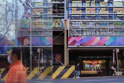
Later that night, I threw $300 in the trash. After fixing the cards, I dropped them off at Marshall’s office. I didn’t realise he was there. When he saw me, he asked me to look out the window. Nestled in the middle of buildings and roads was the familiar muddy purple, this time on the top of a building. I wish I’d known back then that I had created an eyesore that would be in place for many years to come.
“Well? What do you think?” Marshall was beaming with pride. “You did it! You did that!” Marshall kept pointing at me and then the square in the distance. The lowercase ‘i’ in the middle was starting to look way too close to Apple.
“I… love it!” Another lie.
A few days later, Marshall’s business partner asked me to send the font files. I worked around it by sending him high-resolution JPEGs instead. When he came to the office, he asked again. I couldn’t avoid him, so I told him to download it from dafont.com.
“What’s the font name?”
“… Apple…”
“… you used Apple’s font?”
He was pissed. My boss once told me the best way to negotiate with clients is show them a solution.
“Or we could use this?” I showed him a Word doc with a new font.
He calmed down. “Okay, sure. What is it?”
“Times New Roman.”
He stopped talking to me and called someone else asking if they could redo the sign.
Over the next few weeks, Marshall outgrew his corner office and crept into the heart of K Rd, landing on magazine covers as the next property mogul.
A few years ago, my flatmate and I were driving on Symonds Street. I saw the sign and tried to make out the font. I think it’s Times New Roman, I thought to myself. My flatmate must have seen me looking at it while we were stopped at a red light.
“What the fuck is that sign about?”
“I think it’s about Auckland. Reliable and trustworthy. Iconic.”
–